I’ve had pretty much the same logo since the very beginning, with a few minor changes like making the cat shape hand-drawn and adding a watercolor texture to the text. Last week I was doing some hand-lettered logo work for a fellow photographer when I started scribbling “fat orange cat” for myself…and now I’m thinking I really want to change my logo.
I still use Paperfinger’s hand-drawn cat, except with a little transformation in Photoshop to make him plumper and removing the outline. STUDIO is the same font type. What do you think? Current logo is at the bottom.
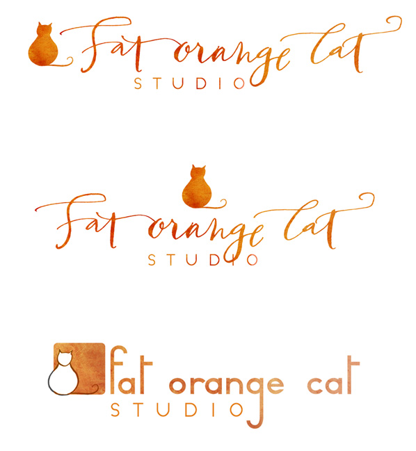
I showed this to Dan and he was underwhelmed. Hmph. I know for the sake of BRANDING (tried really hard not to use that word) it’s best to stick with what you got, especially if it ain’t broke. But what if I’m bored with it? I’m bored!
For fun, here were my original logo comps from nearly 4 years ago!
I’m a fan of the first logo – especially since you’re also a calligrapher. It shows off your awesome lettering skills. :) I’m no marketing expert, so Dan is more than likely right about not changing it. However, I think there should be an entirely different marketing handbook for creatives that says logos/websites change annually. Lol!
I like both the first and second one. The centering on the second one is attractive to me, except for how the “g” in “orange” intersects with the “i” in “studio” below it. But as the commenter before me said, it’s a nod to your work as a calligrapher.
I’m a fan of the 1st one as well — it’s really injecting you into the brand — run with it!
A lurker from your knitting days – I say stick with the original.
I agree with Dondrea – I really like the first one. But if you are trying to make the change more gradually, then the third is the way to go. And I love that one too, it’s a little bit of a nod to the original while still haveing it’s own flair. I just realized that with the line on the cat’s neck it’s like he’s gone from showing us his sumptuous backside to showing us his front. hehe.
I love the first or second- though the second definitely appeals to me the most. :) I love the incorporation of your own lettering and the fat cat!
For what it’s worth, I think the one on top (I think it has more linear flow than the middle) is a vast improvement. The thing I love is that the cat is now actually orange. In your current logo, the cat is actually white. Plus, using your caligraphy shows off what you can do from the start. I say go with the top!
I love both of the new ones, especially the middle one. I always loved your original logo (third one), but now that I see these new ones, I think they are so much more “you.” Coming from a background in marketing, I understand and usually support sticking with something you have built your business on. With that said, you are a creative business, and I think it is totally okay to tweak your logo every few years. It should evolve with you and reflect your change and growth. You are also keeping enough the same – your business name, the cat, the color, the font of “studio” – that it is still recognizable. :) I have the change-my-logo-itch too!
Thank you everyone for your valuable input! I’ve made up my mind!