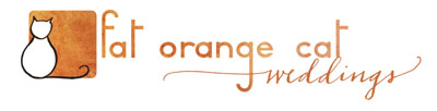
At the beginning of this year I decided I needed to make a wedding version of my logo. I commissioned my graphic designer friend Jesse to update the original logo he made with some wedding elements, such as a gauzy veil over the cat’s head maybe, or a bouquet being tossed, flying across the “fat orange cat” text. Or have flowers petals flying in the breeze. He tried everything I asked and through no fault of his, none of what I requested could be translated very well to a tiny, thumbnail sized logo. The veil over the cat looked like a ghost, the bouquet looked like fly. I was over-complicating things. So I decided I needed to another approach…and turned to calligraphy!
After researching many calligraphers online – some who were very formal and traditional, some who were downright quirky – I discovered the wonderful, wonderful work of Paperfinger. I instantly fell in love with Bryn’s informal script, her casual flourishes and her beautiful illustrations. Her style fits my aesthetics to a T.
See, so pretty!
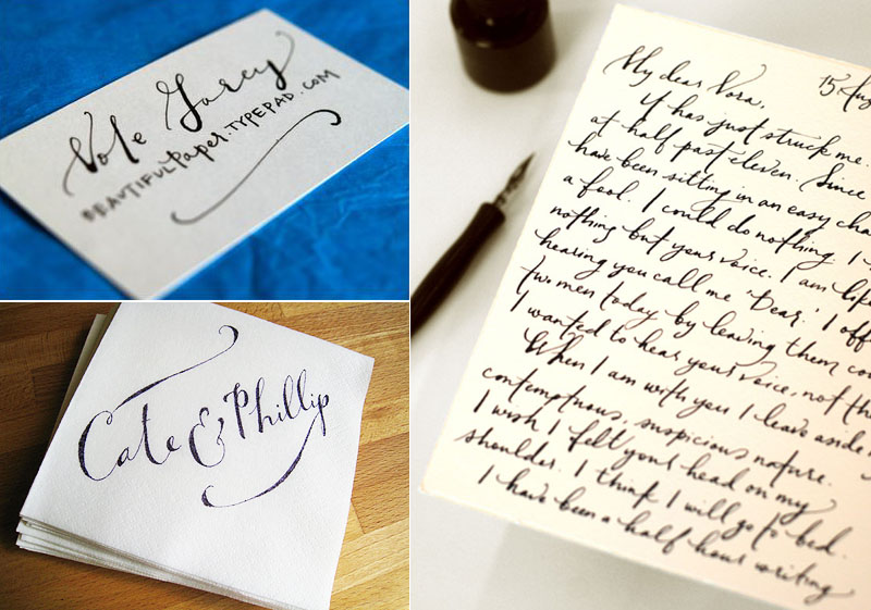
Calligraphy by Paperfinger. Visit her blog here to see more delicious hand-written goodies.
Beautiful writing aside, there were several things that I drew me to about Bryn: barely a year in business, she has already been seen in the pages of Martha Stewart Weddings, is self-taught, and has a computer science degree that she doesn’t care to use. Just like me! Well, I don’t know if it’s just like me, but I for one don’t much care to use my degree anyway! I didn’t find any of these things out until after I already knew I wanted to work with her. We were meant to be…
Bottom line is, I think her work is singular, and very fresh. Maybe being self-taught is a reason for that. No constraints, no rules, just what looks right.
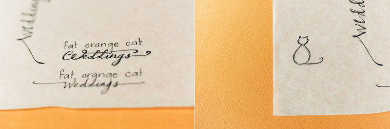
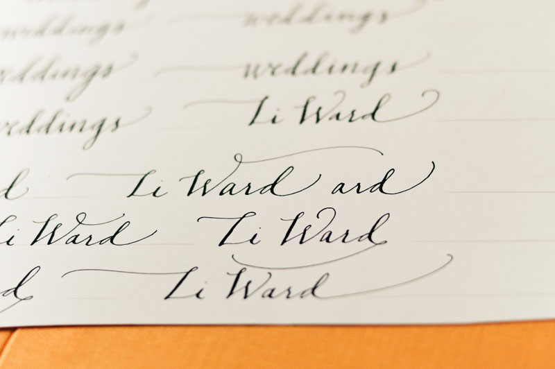
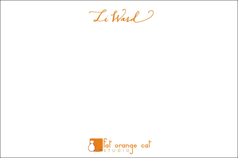
I asked Bryn to draw me the cat shape, a tree branch, write the word “weddings” and also my name. As style guides/inspiration I pointed to Edward Gorey and the gnarly limbs of live oaks, aka the sexiest trees on earth. I also asked her if she would give me her sketches after we were done, and she obliged. I’m not sure which I love more, the final product or the rough drafts. If only my name contained more letters!
Sarah of Parrott Design Studio will be incorporating these into more notecards. I’ve asked her to letterpress several varieties and will be providing her with the 100% cotton Crane’s paper which my mother-in-law, who used to work there, was so generous to give to me. At some point there will be business cards but I haven’t decided yet. I have a feeling I will not want to give away any letterpressed biz cards, because the thought of any crumpled up at the bottom of a purse, or worse, in the trash, is too much!
So in the meantime, notecards. I couldn’t be happier with how well the existing and new hand-drawn elements work together. Simple with just a touch of whimsy. I love how Gorey-esque the cat is, and yet how the curl of the tail still mimics the tail of the g in the “orange” as it did when the cat was digital, and how that flourish is transferred to the “d” in “Ward”. And the “s” in “weddings.” It’s all deliberate!
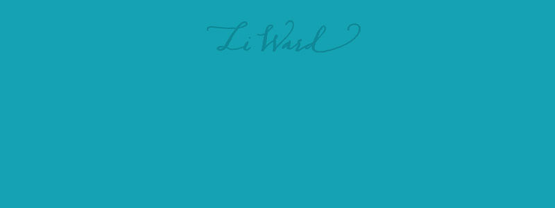
On teal, my name blind-embossed (no ink) and no logo.
And Moo cards, which already have the new cat logo.
Be sure to see some more of Paperfinger’s calligraphy in action here, and this great Q&A I just found. Check out her napkin invites. So simple and so lovely it hurts! ~ Thank you Bryn!
Tasteful.
Li why is anyone but you doing your design??
You’re the best designer you know. I much prefer your stuff yesterday.
Because I love Bryn’s work.
Beautiful! The new weddings logo is both fresh and timeless. It will wear very well.
I think it is a good idea to get other artists on board when working on a project like this – as artists, we are often too close to our own work and have a hard time building an appropriate “first impression” image. Having someone else make a commissioned logo can feel like a gift – sort of like someone has handed you a very flattering mirror and suddenly you can see yourself much more clearly and you look great!
Totally digging the texture of orange background!
Oh! Everything looks great! How exciting. Love the new feel of the site because of it. So perfect!
Excellent! Have to agree with Virgina the wedding logo is fresh and timeless.