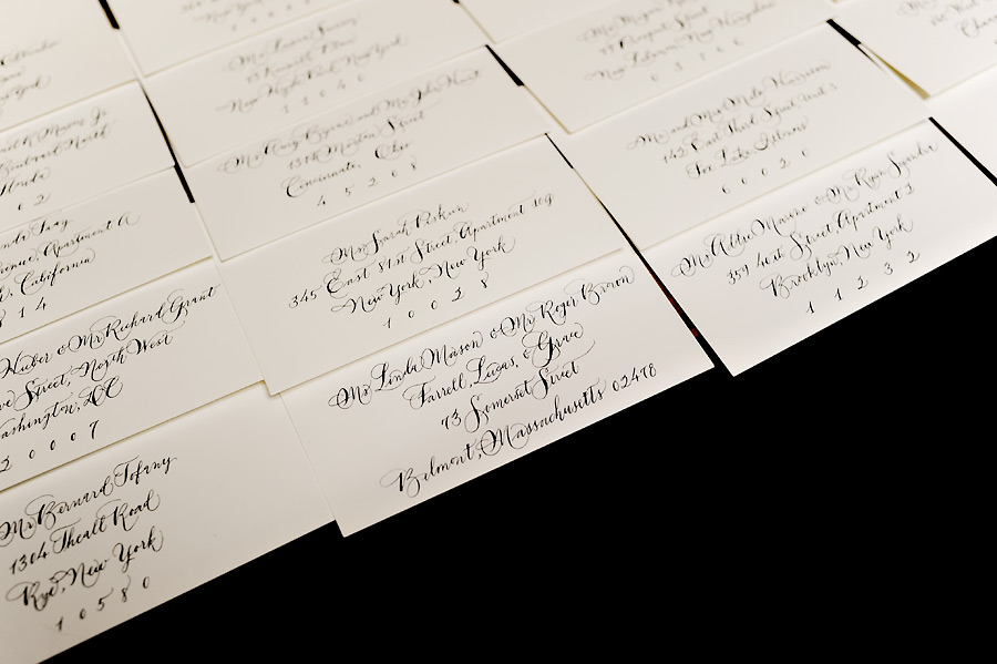
This is my first live attempt at grown-up, not-fooling-around calligraphy. The client wanted something swooshy and romantic. I recently experimented with Spencerian style of lettering, and since I really enjoying it, I decided it would be perfect to use for this project. I feel like this the first time my calligraphy looks “real.”
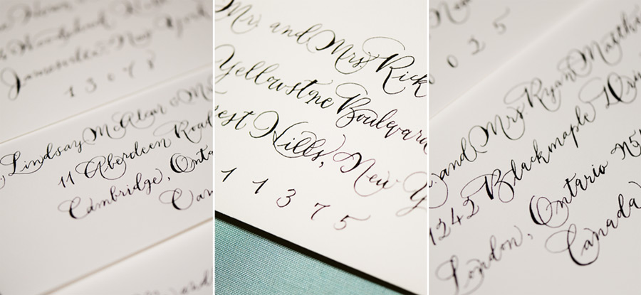
I also feel like my styles are all over the place at the moment. The photography equivalent of post-processing one image vintage, another really colorful, another with a ton of vignetting, and delivering them as a set – a most egregious no-no if you ask anyone. Variety is nice, but I don’t think any of the lettering styles I’ve done look like it came from the same person, which is bad. I can’t help it! I get bored easily.
I think the fact that you have different styles is awesome! Your portfolio shows that you’re adaptable and talented, keep up the great work!! :)
Funny you should say, because my first reaction was how very YOU these still are!!! I think you have such a consistent and awesome style.
I love the variety! It’s nice that you provide so many styles. It would only be weird if every card/line was a different style. Each definitely have a little Fat Cat flair… keep it up. ;)